
28 pages, 8 x 8 inches (Branding Guidelines)
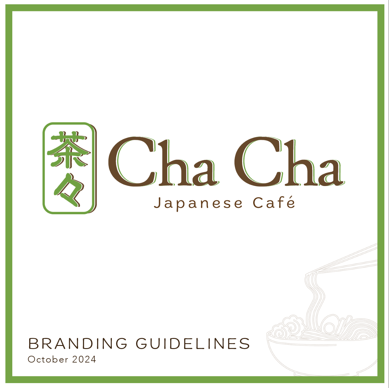
Cha Cha Japanese Café is a local restaurant that specializes in authentic Japanese cuisine. The new branding for this restaurant provides a cohesive and recognizable look through consistent typography, illustrations and color palette. In redesigning the logo, the design stayed close to the original font as to not confuse long-time customers and keep the friendly charm of Cha Cha. The original color palette was refreshed by utilizing green, but softening it to more of a matcha color, as well as implementing shades of brown. The logo symbol is derived from the original Kanji symbol in the old logo, but designed to reference Japanese good luck charms. This set of guidelines illustrates collateral including stationery, aprons, menu, and to-go boxes.
Table of contents

Part of the brand story
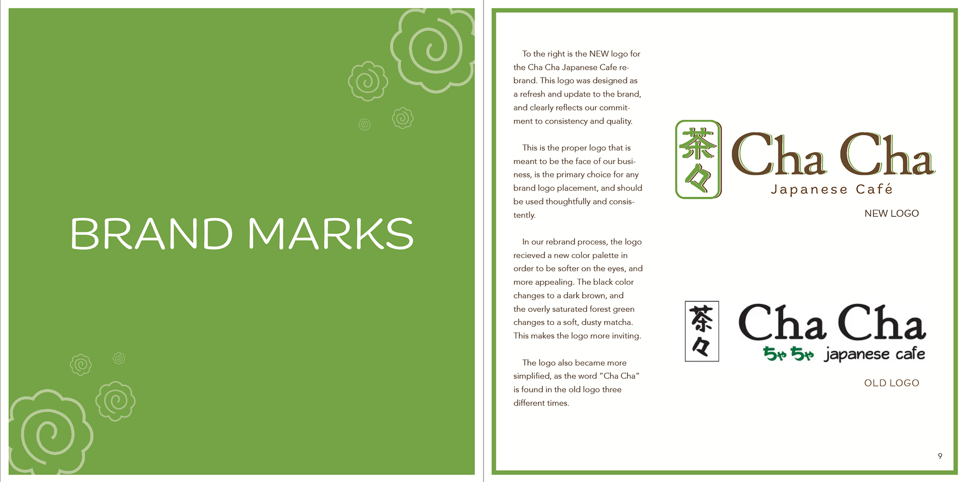
Brand Marks
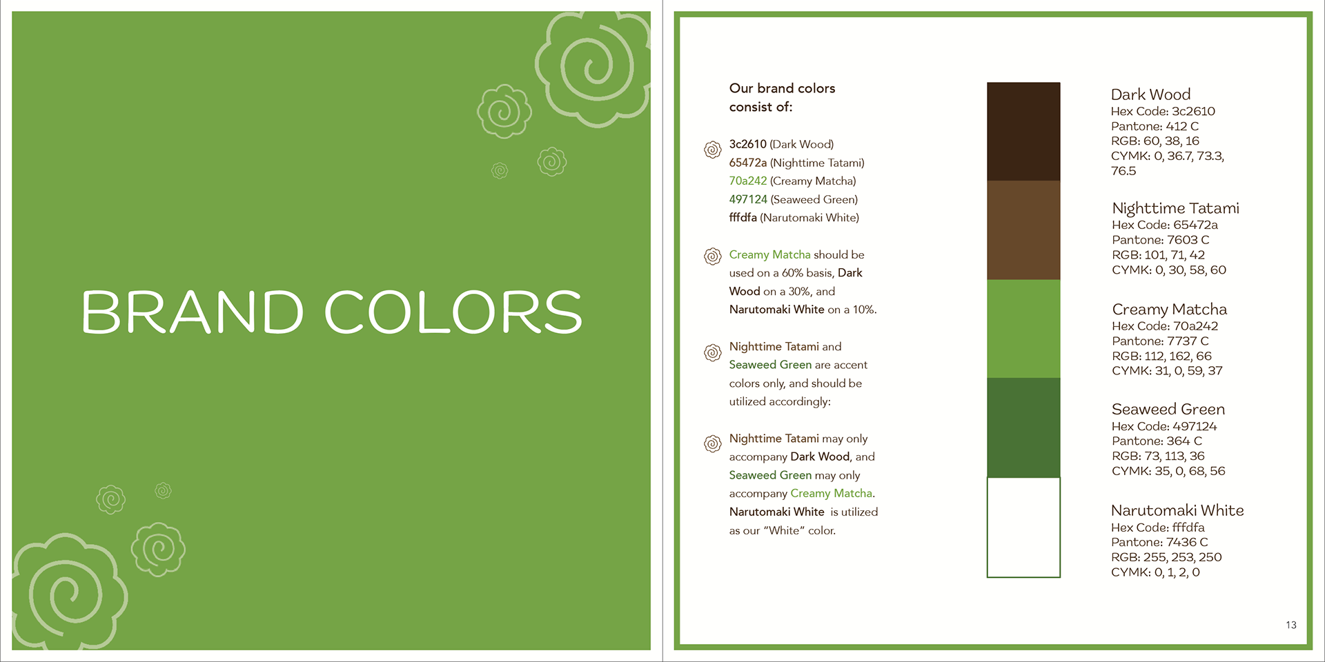
Brand Colors
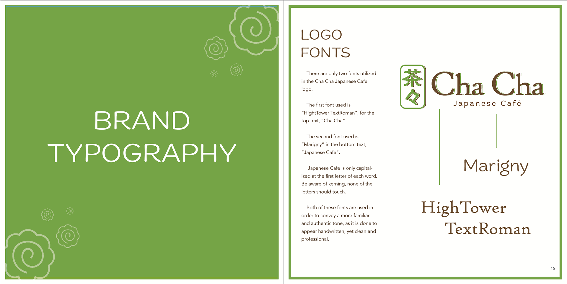
Brand Typography
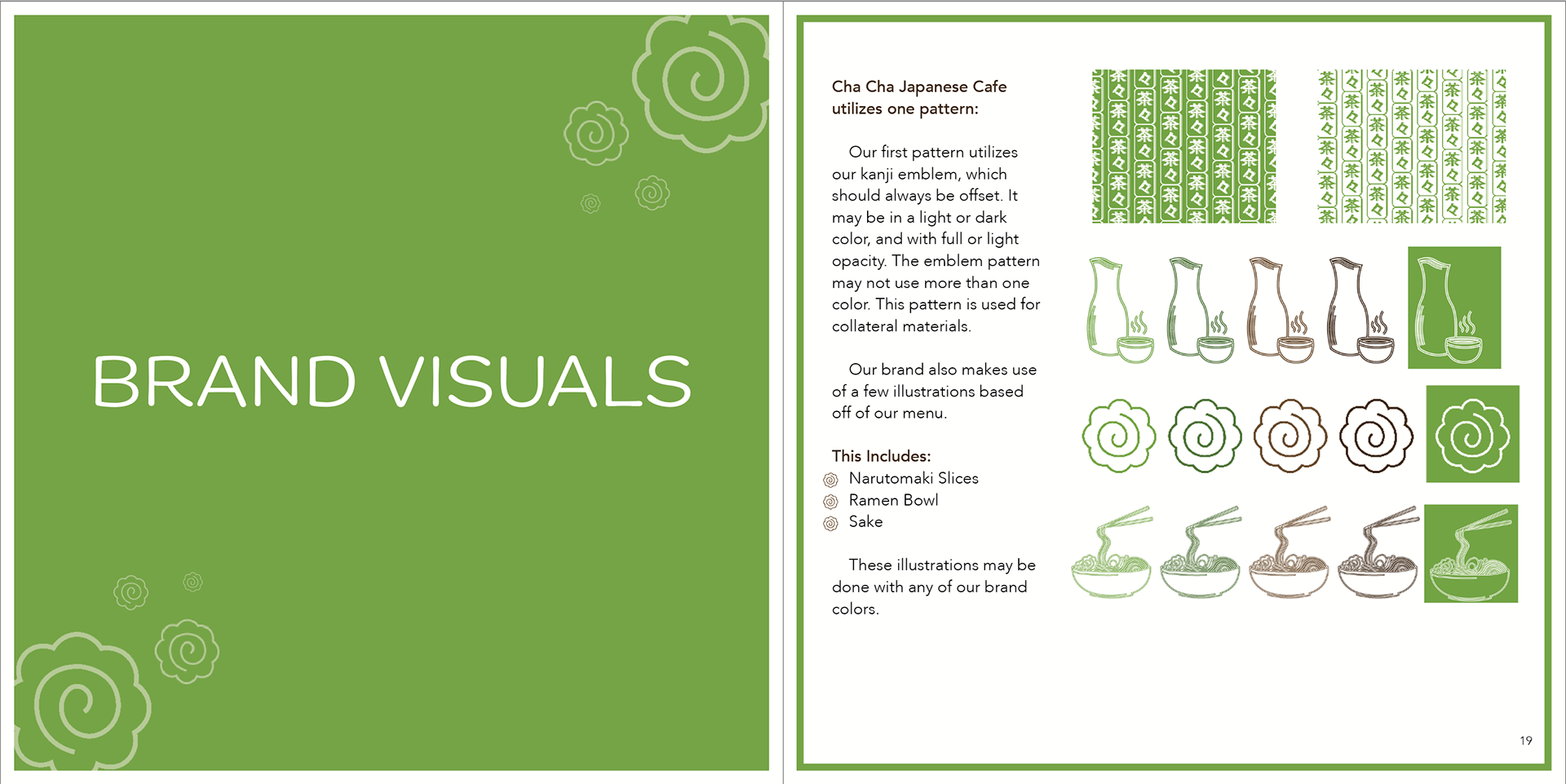
Brand Visuals
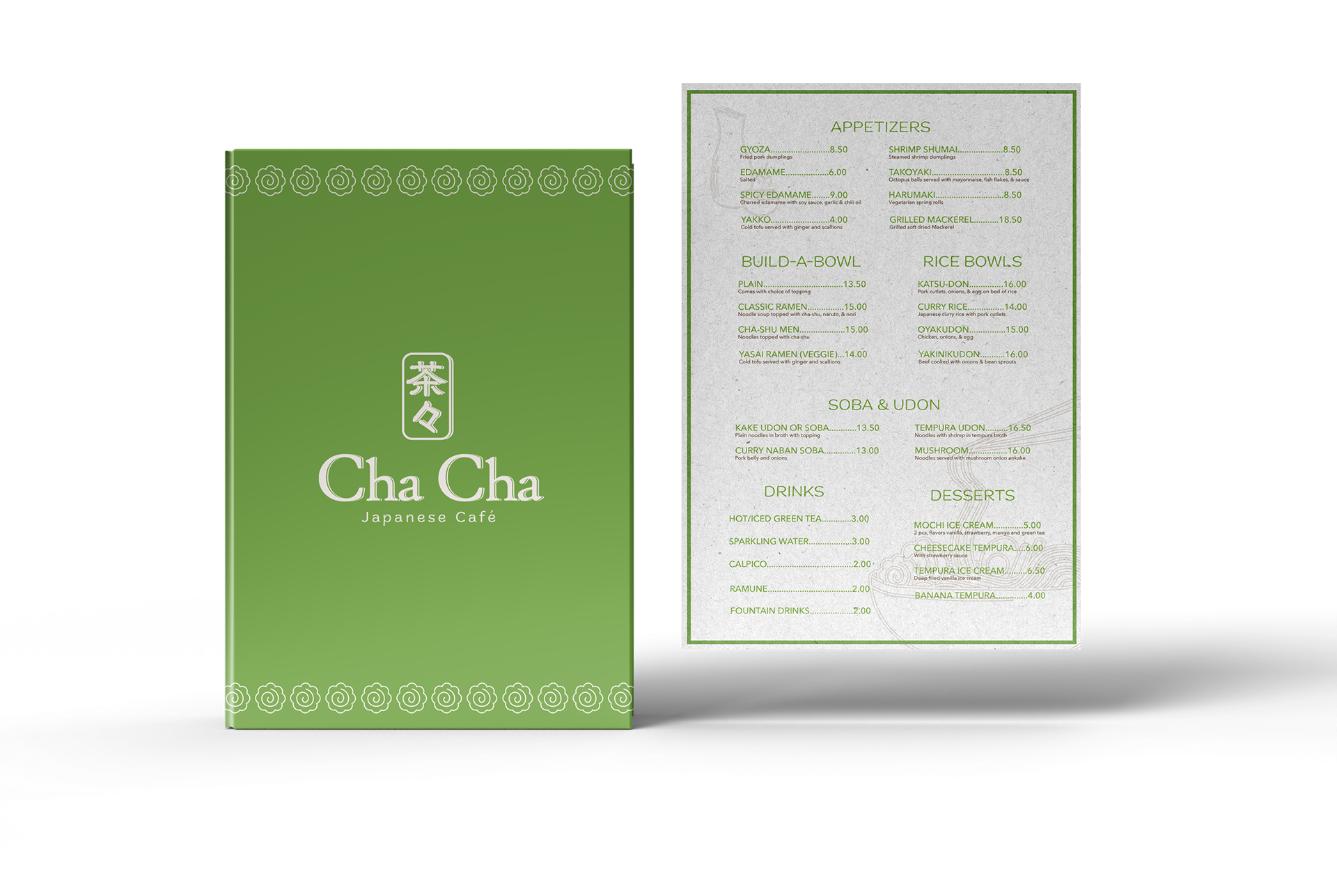
8.5 x 11 in (Menu)
Process
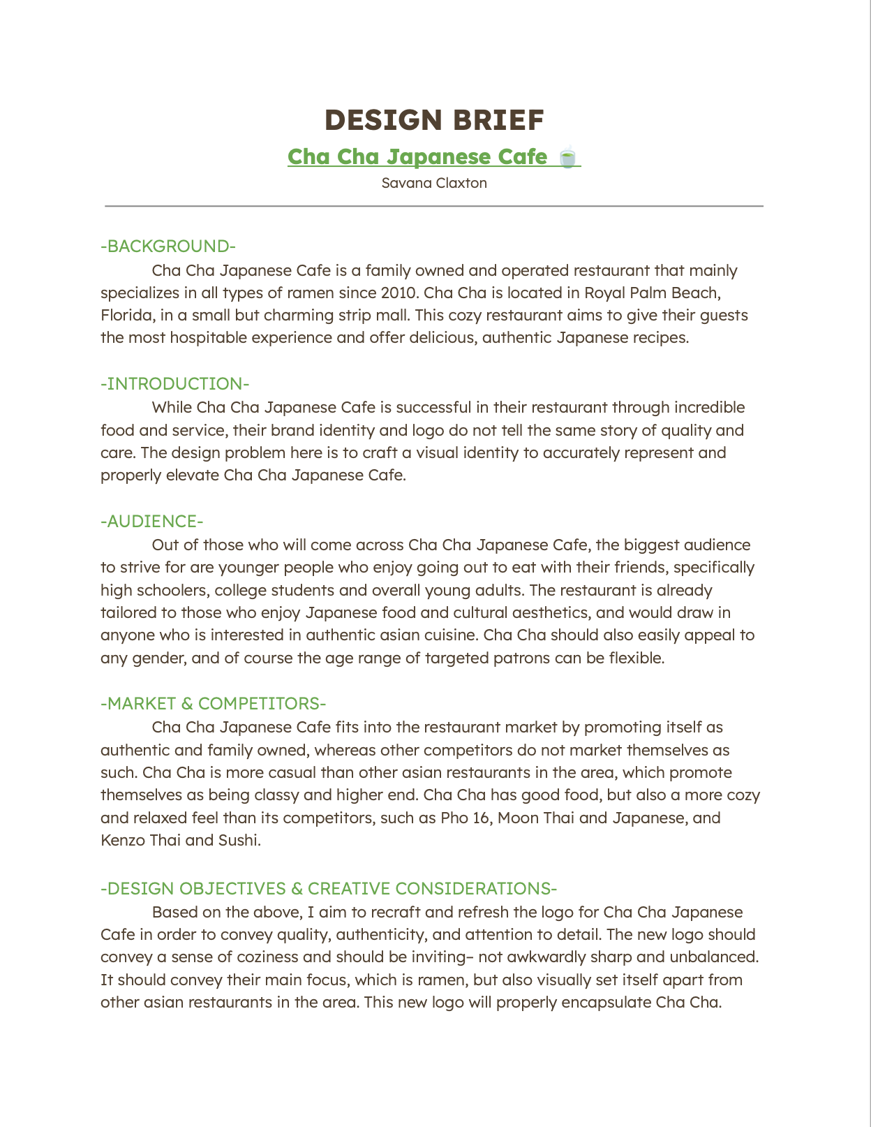
Design Brief
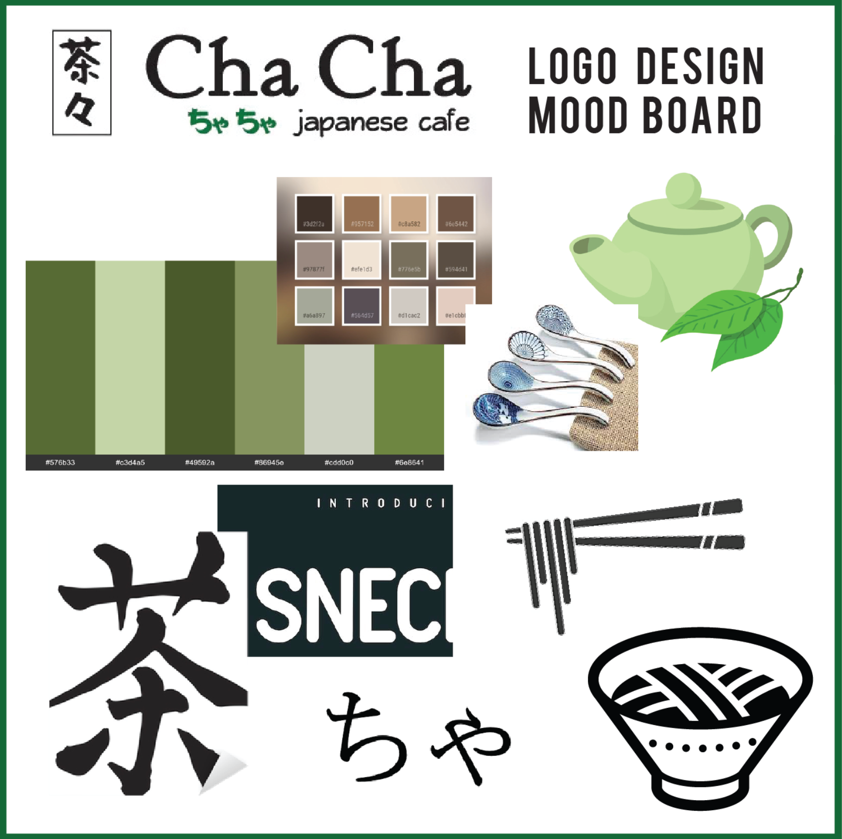
Mood Board
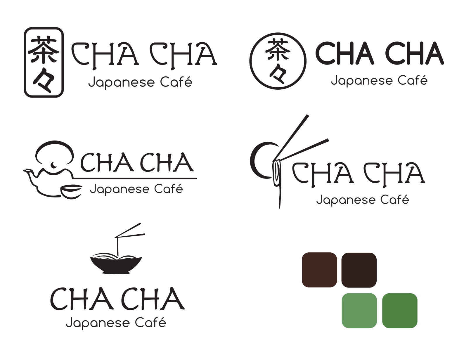
Refined Logos
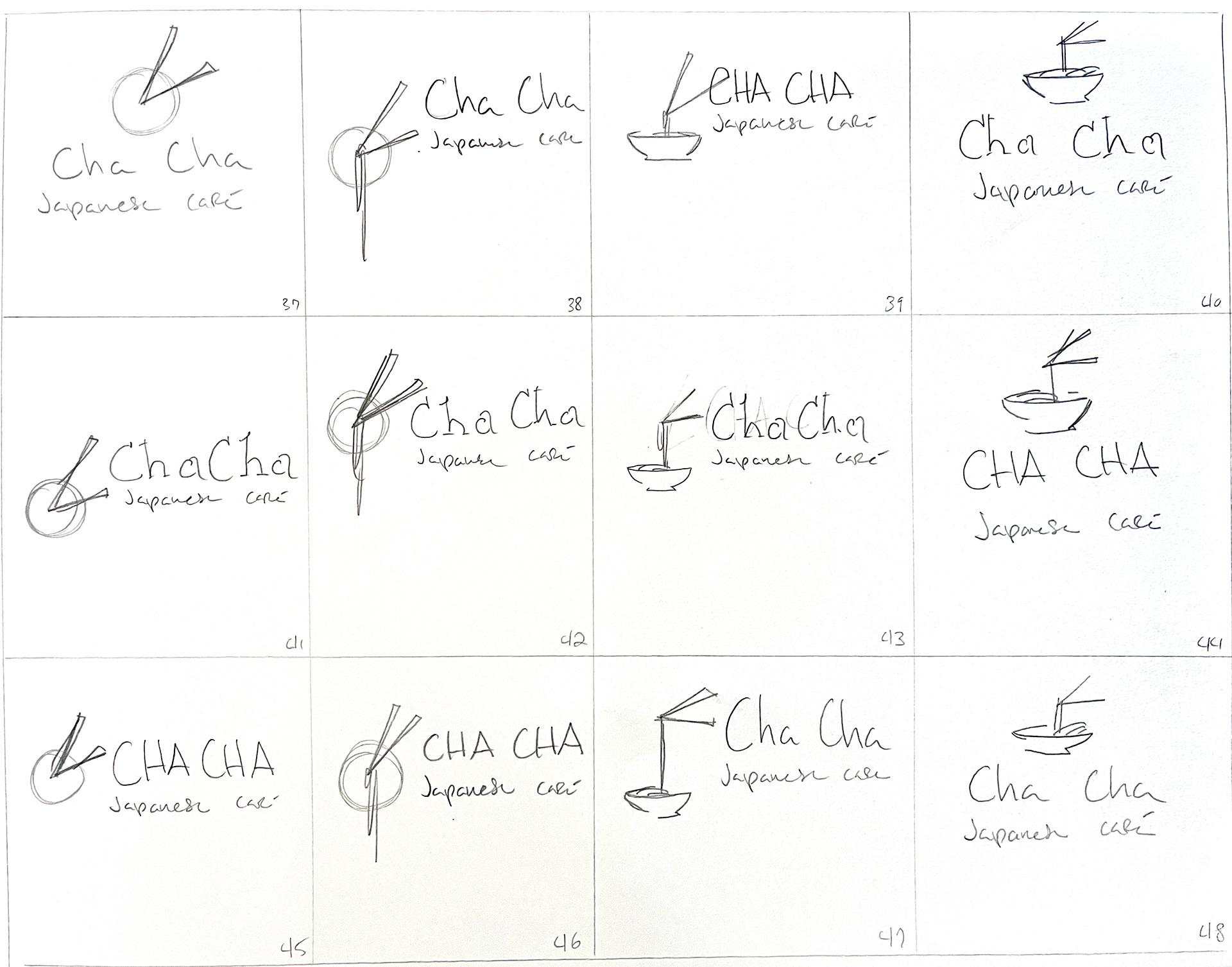
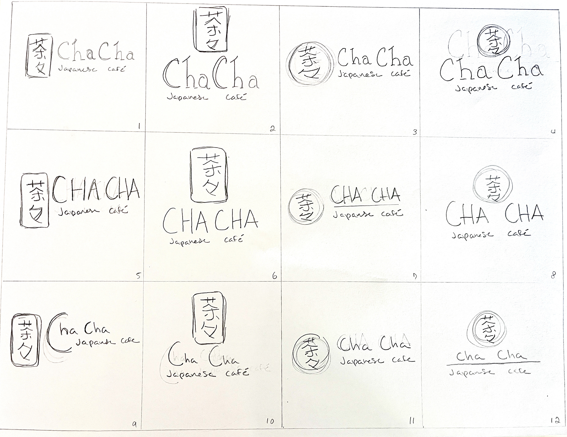
Logo Sketches
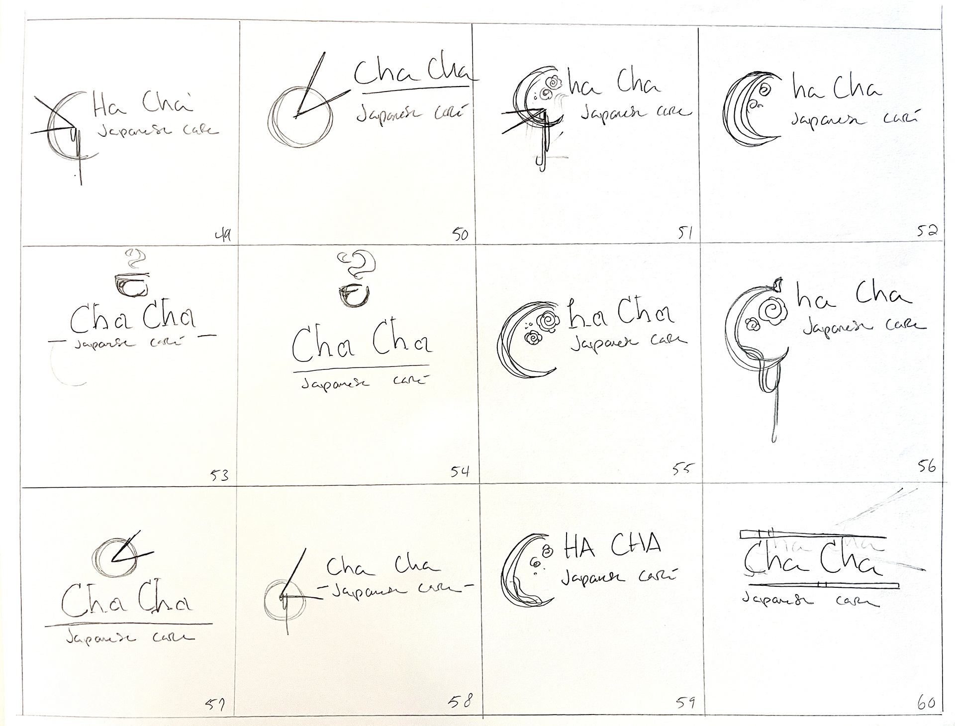
Logo Sketches